How you can optimize conversions with a virtual waiting room

Discover the 5 ways virtual waiting rooms help businesses improve their conversion rates. Plus, get tips and tricks for how to optimize your waiting room for better converting sales events.
Most companies begin using a virtual waiting room to protect their site against peaks in online traffic. But after using the solution for some time, many return reporting a more unexpected benefit: higher conversion rates.
Here’s what a few Queue-it customers have to say:
- “We saw an enormous increase in conversion rates.”
— Joost Van Der Veer, CEO, Winkelstraat.nl - “The conversion rate of our product and people who are waiting in line is very close to 100%.”
— Hans Martin Hansgaard, Co-founder, Stauning Whisky - "With Queue-it in place, the sales of the pint glass alone more than doubled what it was previously."
— Taishi Mizuno, Chief Merchanising Officer, Hills Field - “100% if you are looking for to managing audience/customer journeys to maximize the conversion of your traffic, then this is the product for you.”
— Verified G2 review from user in marketing & advertising - “A side-effect that we realized was that conversion rate had increased at a level much higher than the reduction in visitors to site, increasing revenue.”
— Verified G2 review from user in Information technology & services
What’s happening here? How can making people wait improve sales and conversions?
In this article, you’ll discover 5 ways a virtual waiting room can boost conversions, along with tips and tricks for how you can optimize your waiting room to create better converting events.
In his book Influence: The Psychology of Persuasion, Dr. Robert Cialdini outlines the six key principles that influence how we make decisions. Three of these six principles explain, in part, how virtual waiting rooms boost conversions: social proof, scarcity, and commitment and consistency.
First, social proof.
Social proof is a phenomenon where people tend to use the actions of others to inform their own.
Social proof explains why we think busy restaurants have better food than quiet ones. It explains why reviews and testimonials have such a massive impact on purchase decisions. It explains why when there’s a TV show or movie everyone’s talking about, we feel like we must see it.
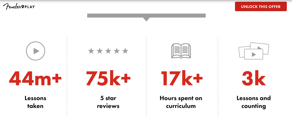
The impact of social proof on conversions and customer confidence is well established. It’s why so many landing pages include a section that looks like this:

When we make a decision, we want to be confident it’s the right one. And the easiest way to do this is to look at the decisions others are making and whether they’re happy with them.
Social proof is built into the act of queuing. After all, what’s a queue if not a group of people who’ve collectively decided something is good enough for them to wait for?
In this way, queues often act as a shortcut for determining quality:
- If there’s a queue for a restaurant, it must be because the food is good.
- If there’s a queue for a concert, it must be because the artist is good.
- If there’s a queue for your sale, it must be because the deals are good.
The social proof effect of queues is so strong that various studies and social experiments have shown people will join a queue even if they don’t know what they’re queuing for.
RELATED: Why Smart Marketers Are Putting Their Shoppers in an Online Queue
A virtual waiting room (an online queue) displays social proof in much the same way as a physical queue. Waiting rooms are often used in periods of high demand—which means if you have one, your brand, product, or sale is in high demand.
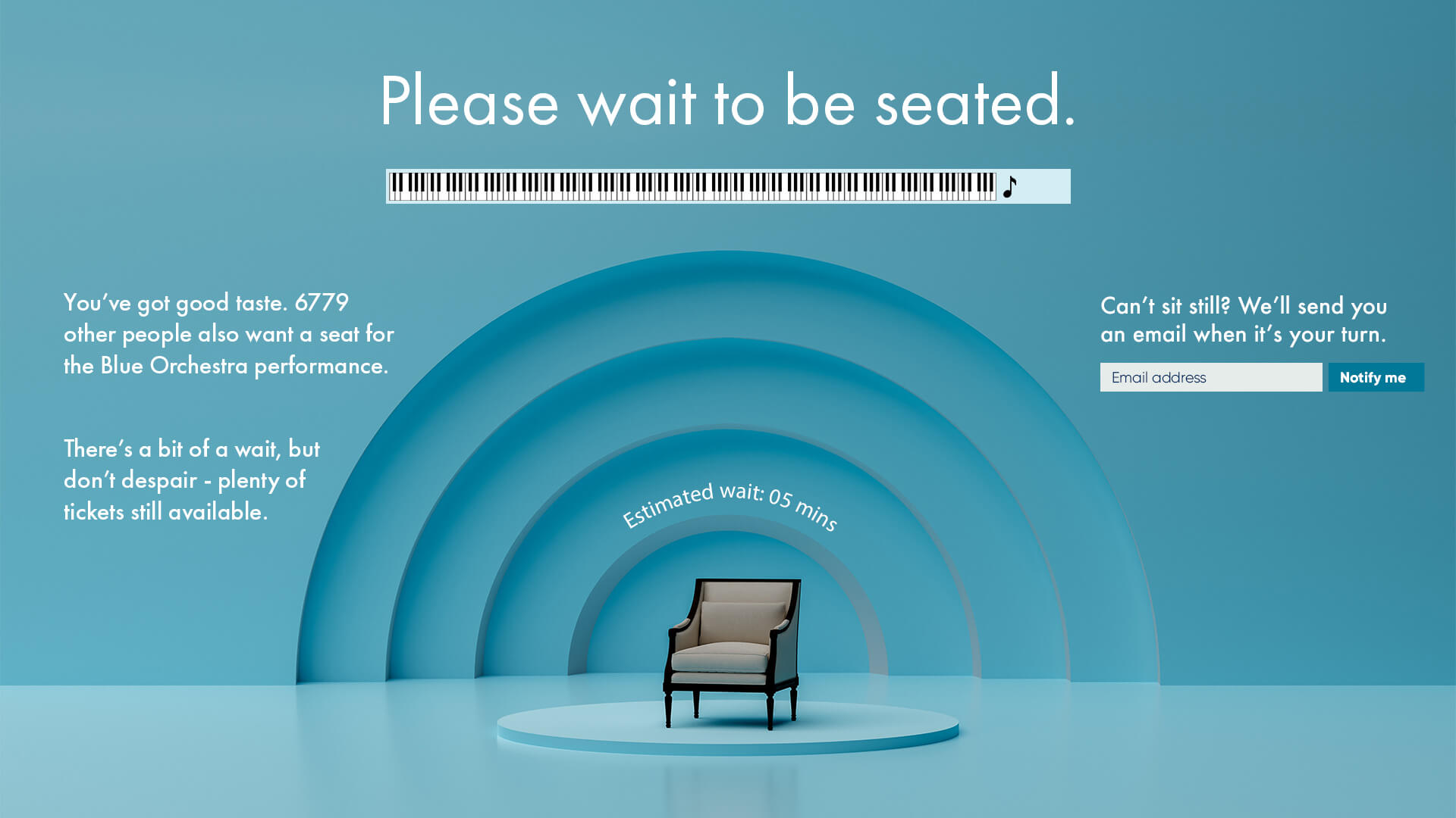
The waiting room also takes the social proof of queues one step further by displaying to all visitors the number of people waiting in front of them. People in your waiting room see “there are 1,000 people ahead of you in line.”
This number signals to customers they’re not alone in their decision to purchase. That the product they want is popular. That others want it too.

Just like with a busy restaurant, the length of the queue for your website ramps up people’s desire to get in. And once they are in, it gives them the confidence to purchase—knowing they’re in good company.
“Being able to show how many people want the product helped us create hype and enhance our brand power. It’s a bit like how the popular kids at school get even more popular. We saw this especially in the cross-selling effect on our other products, which tripled in sales during the drop.”
TAISHI MIZUNO, CHIEF MERCHANDISING OFFICER

The consistency and commitment bias is the tendency to continue to act according to previous decisions we’ve made.
If a customer ends up in your virtual waiting room, it means they probably want to browse your site and complete a transaction. Even if it takes a few minutes to get in, the commitment and consistency bias makes people likely to follow through on that decision.
But once customers have waited even a couple of minutes in a queue, another psychological bias is activated: the sunk cost bias.
The sunk cost bias describes the tendency of people to continue with things they’ve already invested money, effort, or time into.
The sunk cost bias is why people often finish movies or books even if they’re no longer enjoying them. It’s why it’s so difficult to give up on a doomed work project you’ve already spent days on. It’s why some relationships last quite a bit longer than they should.
In all these scenarios, people don’t want to give up on something they’ve already sunk time and effort into. They don’t want to render that time and effort wasted.
The sunk cost bias applies to waiting, too.
If you’ve already waited 5 minutes, you may as well wait another 5—otherwise the first 5 would be wasted.
But the true magic of the sunk cost bias on conversion rates occurs after customers get to the end of their wait and are flowed to the website.
Now that you’ve waited for 10 minutes to access a site or page, what are you going to do? Leave without buying anything? Of course not.
People who’ve waited for a purchase are much more likely to make that purchase—if for nothing else, to ensure the wait was worthwhile.
One study—aptly titled “Making the Wait Worthwhile”—even found that the longer customers wait, the more they’re likely to spend.
This is one of the key reasons companies see conversion rates increase so often after implementing a virtual waiting room: the act of waiting increases customers’ intention to purchase.
While the sunk cost bias can improve conversions, we don’t recommend artificially inflating your wait times. Providing a fair and transparent wait is more important and can provide longer-term benefits to customer loyalty.
RELATED: The Power of Anticipation Psychology & How to Use it For Ecommerce Marketing
Of the three of Cialdini’s principles of influence, scarcity is perhaps the most used in marketing.
Scarcity marketing has time and time again proven to optimize conversions and boost sales. It’s based on a simple principle: the scarcer something is, the more people value it.
Scarcity marketing is why limited-edition product drops drive such huge hype. It’s why scalpers can charge thousands for sold out concert tickets. It’s why time-limited flash sales drive huge spikes in site traffic.
Virtual waiting rooms are often used in scarcity scenarios like these. Scarcity drives huge web traffic, and waiting rooms help businesses handle huge web traffic.
But the waiting room introduces another element to the mix that ramps up the hype and purchase-intent even more: social proof and competition.
You see, when scarcity marketing is combined with social proof, it becomes competition. And according to Cialdini, competition supercharges customers’ desire for products. He says, “Not only do we want the same item more when it is scarce, we want it most when we are in competition for it.”
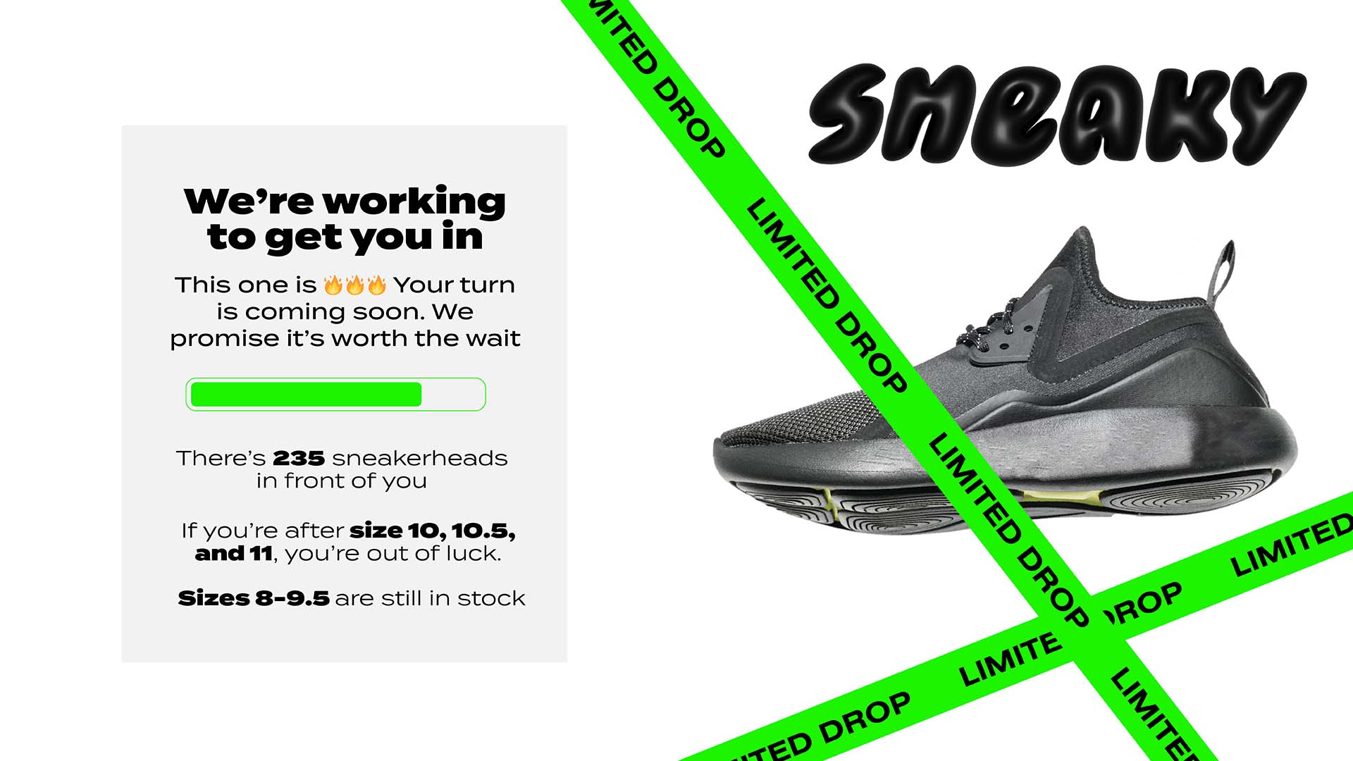
Customers trying to buy a limited-edition pair of sneakers, a hyped brand collaboration product drop, or ticket to a popular event, already know what they want is limited in quantity. So by showing them how many people are in the waiting room, you create an immediate sense of competition. They quickly realize there are thousands of others vying for the same products as them, and that the event will sell out.
Major streetwear and sneaker brands know the power of competition and amplify it in their marketing collateral. Likewise, many waiting room users leverage the waiting room page to show off how exclusive and limited their products are.
Nike’s sneaker drop notification below serves as an expert lesson in writing copy that exudes both scarcity and demand. Their drops are “extra-special”, “coveted”, “hot”, and “quantities will be limited.”

RELATED: 7 Simple Scarcity Marketing Tactics to Supercharge Ecommerce Sales
Try to use similar language on your own waiting room page if you want better converting sales. Or, use the waiting room communication pane to provide stock updates that show products selling out in real-time. This can create an even stronger sense of urgency and competition for customers.

When customers see products selling out and that thousands of others are trying to get into the website at the same time, conversions skyrocket. Why? Because the waiting room sends them a clear message: if they don’t buy, someone else will.
Many customers visit your website with a specific product in mind. Maybe they’ve come for your latest product drop, the major ticket onsale you’re hosting, or your discounts on consumer tech.
When these single-minded customers are placed into a waiting room, you get a unique opportunity to affirm their decision to purchase and showcase your other offerings.
The waiting room acts like the big lit-up menus behind staff at fast food chains. You may queue at McDonald’s with plans to get a quarter pounder, but while you’re waiting you notice they have a new burger you’ve never tried before, or that upgrading to a meal is only $3 extra.
McDonald’s puts these signs up for the same reason our customers put deals and offers on their waiting rooms: they have people’s attention, and they sell more if they use it.
Britain’s most popular gallery Tate Modern, for example, use their waiting room for ticket onsales as an opportunity to direct customers to the merchandise store.
“We put a banner on the waiting room page that links you through to the shop website with the promo code … The uptake on that is really good and that's great for a customer because it's a little added bonus that they weren't expecting. That's great for us because it drives more revenue as well.”
JON HAWORTH, SR. COMMERCIAL SYSTEMS MANAGER

When Hills Field ran a hyped product drop using a virtual waiting room, they were shocked by the "cross-selling effect on our other products, which tripled in sales during the drop"
Queue-it is fully customizable, meaning many companies get creative and use their waiting room as a piece of marketing material. Companies embed on their waiting room page:
- Videos & trailers
- Special promo codes
- Digital catalogues & menus
- Music playlists
- Email forms for customers to sign-up for loyalty programs & newsletters
- Links to company social media accounts
When customers are in your waiting room, you have their attention. If you make the most of that attention, you can boost your sales once they proceed to your site.
Uncontrolled website traffic can dramatically slow down your site. And slow websites kill conversions.
A site that loads in one second has a conversion rate 4.5x higher than one that loads in 4 seconds.

RELATED: 91 Powerful Statistics That Show Why Your Ecommerce Site Speed Matters
You might be thinking “if conversions drop so dramatically when load times are slow, won’t making people wait in queue make them drop even more.”
The difference lies in how you make customers wait—not how long.
A website that loads slowly is frustrating because it indicates something is wrong. It’s not expected behavior. It’s not what should be happening.
It’s more like walking into a store with no staff than waiting in a queue.
Virtual waiting rooms, on the other hand, are built with the tenets of queue psychology embedded into them. They let you:
- Keep visitors occupied with information or media
- Show that the wait has started with a progress bar
- Show the length of the wait with an estimated wait time
- Explain the reason for the wait with copy on the waiting room page
- Ensure the wait is fair with first-in, first-out functionality & bot protection
RELATED: The Psychology of Queuing Revealed in 6 Simple Rules

80% of customers are willing to wait in an online queue for an hour if the wait is fair and transparent. But if the website is slow, 2 out of 3 shoppers will leave after just 6 seconds.
Because the waiting room keeps your site running at optimal capacity, when customers get to your site they get the fast, smooth experience they expect. And customers who shop on a fast and smooth site are far less likely to bounce.
So it may seem counterintuitive, but making customers wait to access your site or product page can actually speed up the customer journey and increase conversions:
“When you think of a waiting room, you think of waiting, right? But the overall days’ worth of transactions after implementing Queue-it actually happened in a fraction of the time, because people could get in and get out and complete their transactions without any issues. Most of our transactions were done within 15 minutes.”
JUT MCDANIELS, REGISTRATION SOFTWARE COORDINATOR

As our enterprise architect James Beal likes to say: slow is smooth, smooth is fast.
While most customers use a virtual waiting room for site protection, many discover the waiting room improves their conversion rate and sales. There are 5 key reasons why:
- Social proof: queues show off a company’s popularity.
- Commitment & sunk cost bias: people stay in queues because they’ve already committed to accessing a website, then they’re more likely to convert because they’ve already spent time queuing.
- Scarcity marketing: queues combine scarcity and social proof to create competition over goods and FOMO for customers.
- Cross-selling & showing off products: the waiting room is an opportunity to promote your products and brand, which often results in cross-selling.
- Fast websites convert better: the waiting room keeps your site running at optimal capacity, keeping you from losing customers due to slow load speeds and errors.
