Your digital billboard: 12 ways to use your waiting room as a marketing asset
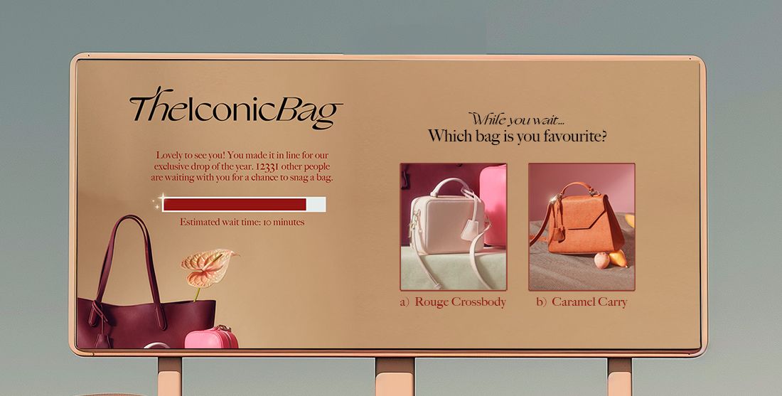
If you had the chance to show or direct thousands of highly engaged potential customers to one thing, what would you do with it? Queue-it clients get that chance every time they design their waiting room custom theme. Discover 12 ways companies customize their waiting rooms to cross-sell products, drive membership signups, ramp up purchase intent, and grow marketing channels.
A virtual waiting room is more than just site protection, it’s a marketing asset.
It’s a fully customizable digital billboard you get to show the thousands of eager customers waiting to access your site.
Used right, your waiting room can boost conversions, drive cross-selling, incentivize membership signups, and increase social media engagement.
Over the past 10 years, we’ve created thousands of custom waiting room themes for thousands of customers, from The North Face to the State of New Hampshire to Ticketmaster.
Because you can customize the waiting room with any combination of HTML, CSS, and JavaScript, the options for how you tailor it to your brand and goals are virtually limitless.
Here’s 12 ways you can get the most out of your custom theme and ensure your waiting room becomes the valuable marketing asset it can be.
Table of contents
- Cross-sell products
- Increase AOV with exclusive discounts
- Drive loyalty program signups
- Ramp up purchase intent
- Tap into social proof to boost conversions
- Create competition with scarcity marketing
- Promote social media engagement
- Increase YouTube views & Spotify streams
- Get first-party data for personalization
- Earn via affiliate & partner marketing
- Sell retail media
- Answer "What's next?"
Many customers visit your website with a specific product in mind. Maybe they’ve come for your latest product drop, the major ticket onsale you’re hosting, or your discounts on consumer tech.
When these single-minded customers enter your waiting room, you get a unique opportunity to showcase your other offerings and encourage cross-selling. For example:
- If you’re running a concert ticket sale, you can promote other upcoming events
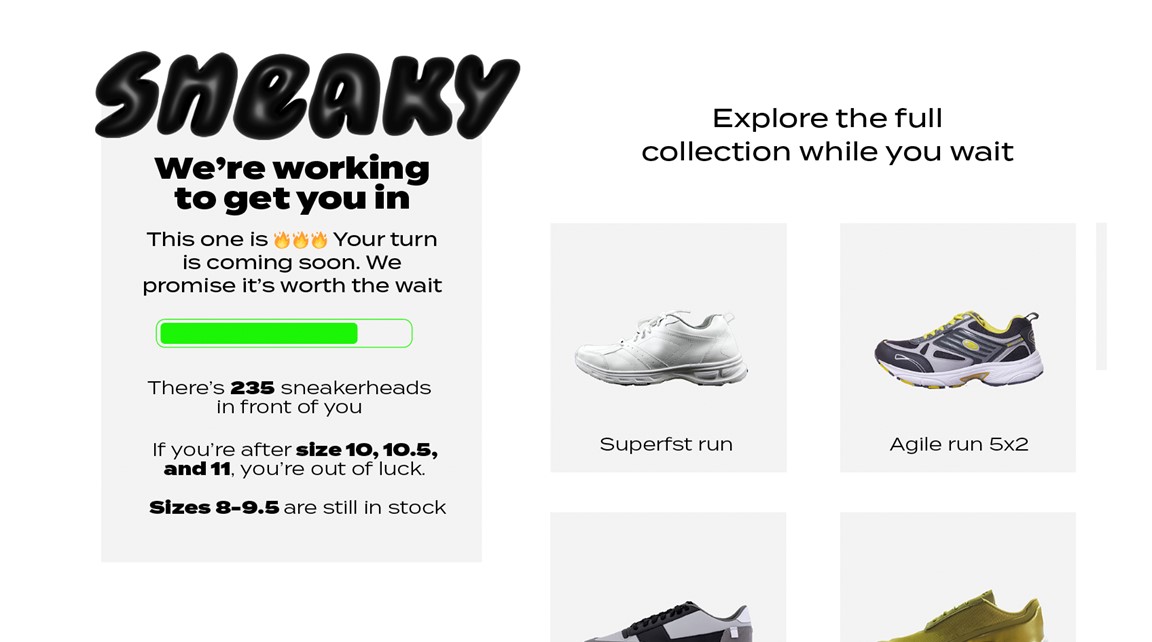
- If you’re launching a fashion product or collection, you can let customers browse the full lookbook
- If you’re selling a gaming console, you can promote your games & accessories
- If you’re running a sneaker drop, you can show off products in your core collection
RELATED: Custom Waiting Room Gallery: Explore 30+ Waiting Room Examples
Plus, if you’re only gating access to a single product or sale, you can encourage customers to browse the rest of your site in a separate tab while they wait. For many companies, it’s only one high-demand product or sale that risks site performance, so you can typically safely direct customers to other pages (provided you’ve done testing).
“Being able to show how many people want the product helped us create hype and enhance our brand power ... We saw this especially in the cross-selling effect on our other products, which tripled in sales during the drop.”
TAISHI MIZUNO, CHIEF MERCHANDISING OFFICER

Encouraging cross-selling helps increase your average order value (AOV). But it’s not the only way to increase your AOV with a waiting room.
Several Queue-it clients use their waiting rooms to offer exclusive promo codes and/or discounts to customers. This tactic lets you reward customers for their patience while encouraging them to take advantage of the deal and increase their basket size.
Britain’s most popular gallery, Tate Modern, used this tactic during their ticket onsales, where they included a link to the merchandise store with an exclusive promo code.
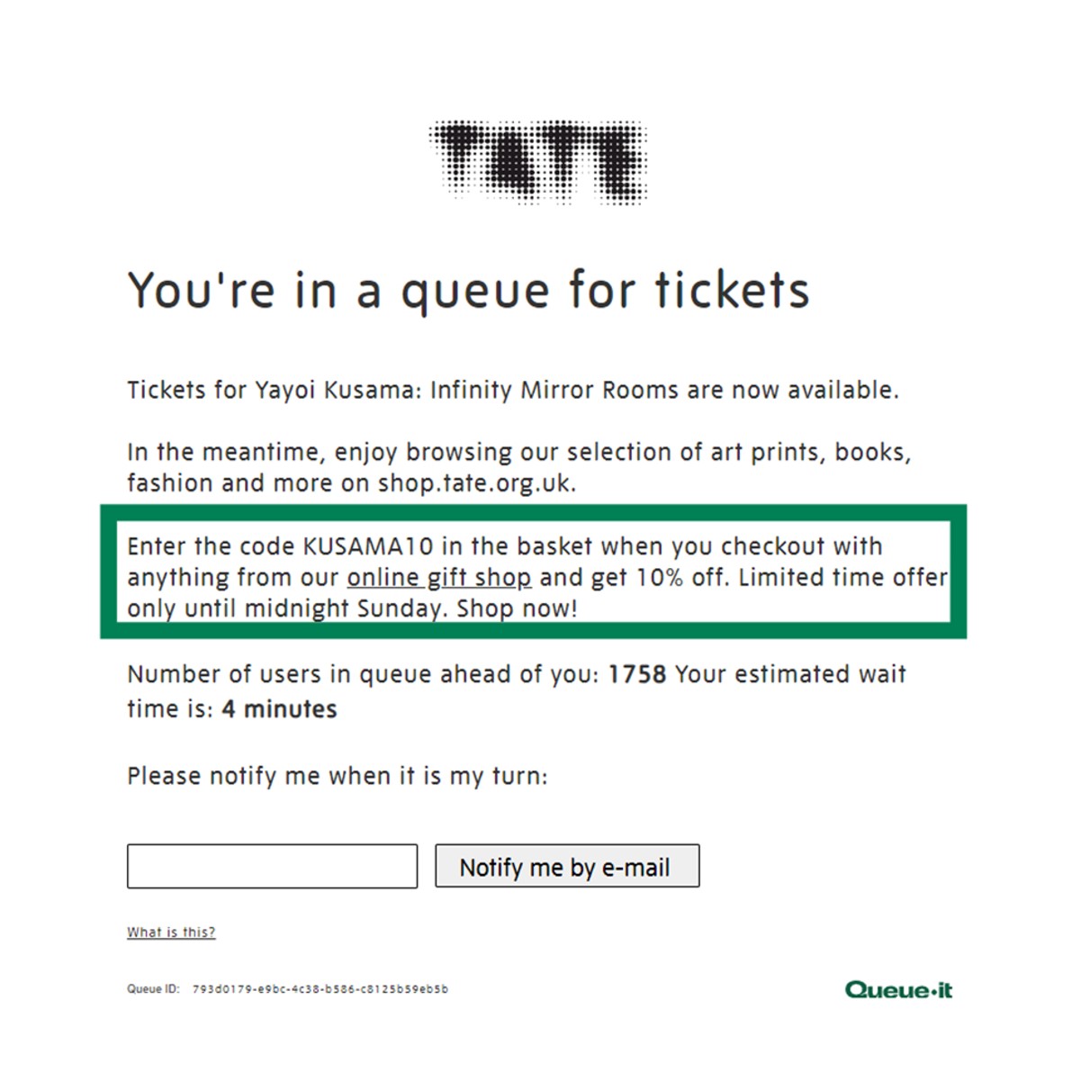
“We put a banner on the waiting room page that links you through to the shop website with the promo code … The uptake on that is really good and that's great for a customer because it's a little added bonus that they weren't expecting. That's great for us because it drives more revenue as well.”
JON HAWORTH, SR. COMMERCIAL SYSTEMS MANAGER

Your waiting room is typically active when demand for your products is at its peak. By adding a loyalty program or newsletter sign-up form to your queue page, you can use that demand to capture first-party data and boost marketing channels.
You can add an email form to any custom queue page, but many Queue-it customers such as The North Face and SharkNinja take this one step further using the invite-only waiting room.
With an invite-only waiting room, the email form on your queue page can act as a “queue fast pass” that gives customers who sign up immediate access to a separate, gated queue exclusively for members.
RELATED: Control Sales Access & Grow Your Customer Base with The Invite-only Waiting Room
One enterprise retailer we work with added 50,000 membership sign-ups across two drops using this technique. Another increased their membership base by 40% across four drops.
Before Bedre Nætter’s Black Week sales went live, they protected their whole site with Queue-it’s waiting room. Bedre Nætter explained on the waiting room that customers who joined their VIP program could get site access four hours earlier than the general public.
A full 25% of people who visited this page gave their email in exchange for early access to the sale.
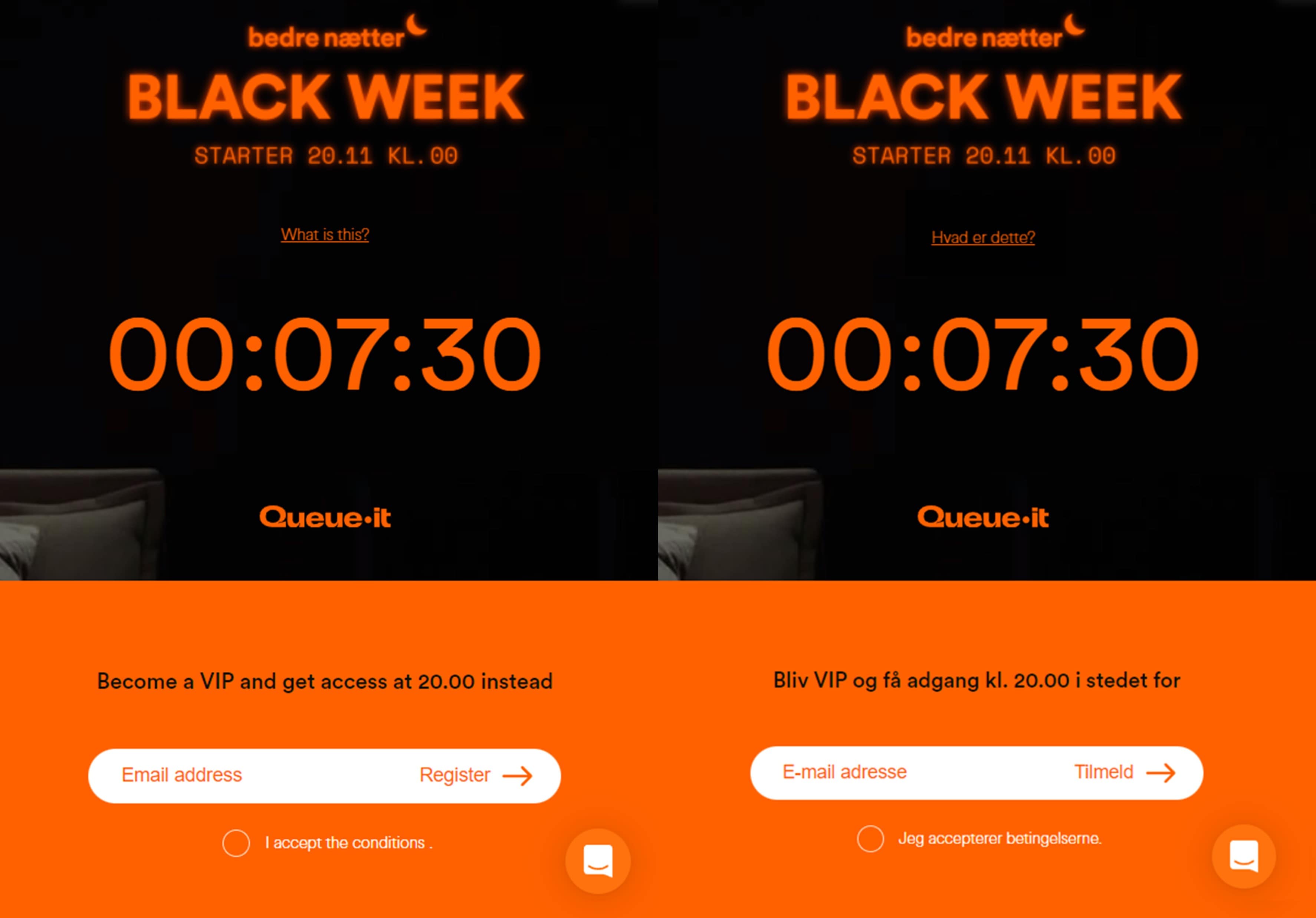
Bedre Nætter's pre-queue countdown timer with sign-up form for early access. In translated English (left) and original Danish (right).
“All the members that came through the invite-only queue had a very high conversion rate. We hit our sales target for the night in the first 11 minutes. In just three hours, we hit the sales target for the whole week.”
MARCUS FORSBERG, HEAD OF ECOMMERCE & PERFORMANCE

If you’re selling a particular product, the queue page is an opportunity to ramp up purchase intent by showing off your marketing material and educating customers.
Because the queue page is fully customizable, it can essentially act as a duplicate of your product page (excluding features like “add to cart” and real-time inventory updates).
You can include your product imagery, detailed product descriptions, a size guide, delivery information, the inspiration behind the product, and whatever else you’ve got on your product page.
Like a real estate agent showing a house, you can let customers explore the product and imagine themselves owning it. You can ramp up purchase intent by showing them why it’s worth the wait.

One of the primary marketing benefits of a virtual waiting room comes from its built-in social proof, which many customers report leads to increases in conversion rates.
Social proof is built into the act of queuing. After all, what’s a queue if not a group of people who’ve collectively decided something is good enough that it’s worth waiting for?
A virtual waiting room (an online queue) displays social proof in much the same way as a physical queue. Waiting rooms are used in periods of high demand—which means if you have one, your brand, product, or sale is in high demand.
RELATED: How You Can Optimize Conversions with a Virtual Waiting Room
The waiting room also takes the social proof of queues one step further by displaying to all visitors the number of people waiting in front of them. People in your waiting room see “there are 1,000 people ahead of you in line.”
This number boosts conversion rates by signaling to customers they’re not alone in their decision to purchase. That the product they want is popular. That others want it too.
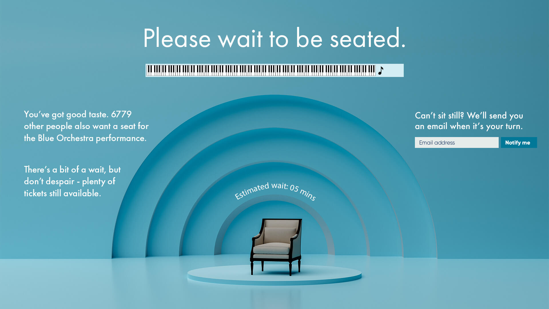
“People get put in a queue and they think, ‘Oh wow, this event is popular, it’s going to sell out, I have to buy tickets to it.’ They see that so many other people are interested. I think that’s why we see higher conversion rates in our sales that have queues.”
MIJAIL PAZ, HEAD OF TECHNOLOGY
To ramp up the conversion-boosting power of social proof even more, you can combine it with scarcity marketing to create a sense of competition among customers.
Social proof tells customers there are others who want what they want. Scarcity marketing tells customers your products are limited in quantity. Combine the two, and you’re letting customers know they’re competing with others to purchase a product that will sell out.
In his book Influence: The Psychology of Persuasion, Dr. Robert Cialdini says, “Not only do we want the same item more when it is scarce, we want it most when we are in competition for it.”
Major streetwear and sneaker brands know the power of competition and amplify it in their marketing collateral. Likewise, many waiting room users leverage the waiting room page to show off how exclusive and limited their products are.
RELATED: 7 Simple Scarcity Marketing Tactics to Supercharge Ecommerce Sales
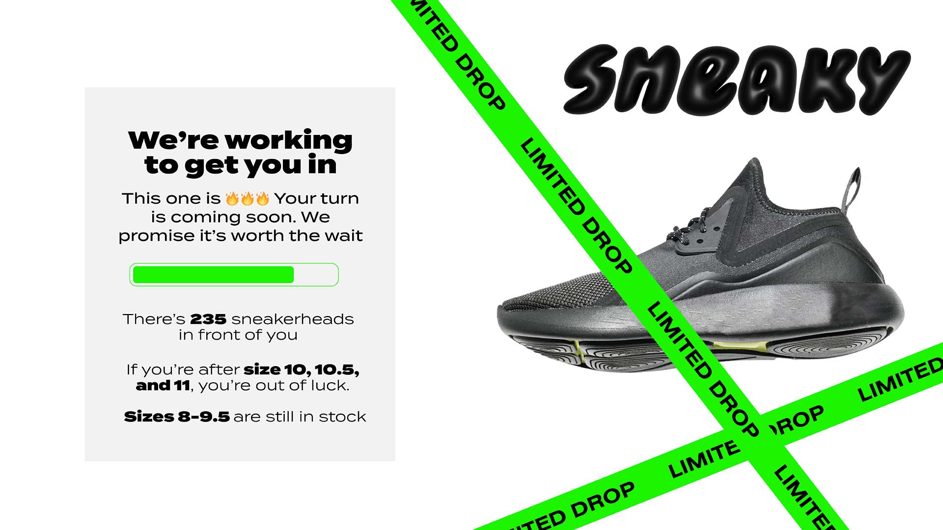
Nike’s sneaker drop notification below serves as an expert lesson in writing copy that exudes both scarcity and demand. Their drops are “extra-special”, “coveted”, “hot”, and “quantities will be limited.”

Try to use similar language on your own waiting room page if you want better converting sales. Or, you can use the waiting room communication pane to provide stock updates that show products selling out in real time. This can create an even stronger sense of urgency and competition for customers.
If you’re interested in growing your social media channels or presence, your waiting room can be the perfect tool to encourage that.
The waiting room is fully customizable, so the main limitation to how you’ll boost your social channels is your imagination. Some examples we’ve seen include:
- Add links to your social channels, telling customers they can “get the latest updates”, “stay up to date with new drops”, etc.
- Embed a branded post or feed from TikTok, Instagram, or X
- Include a hashtag on your queue page for people who participated in the event
- Allow visitors to share the queue page and/or their spot in line directly to social media
- Promote a social media competition or giveaway
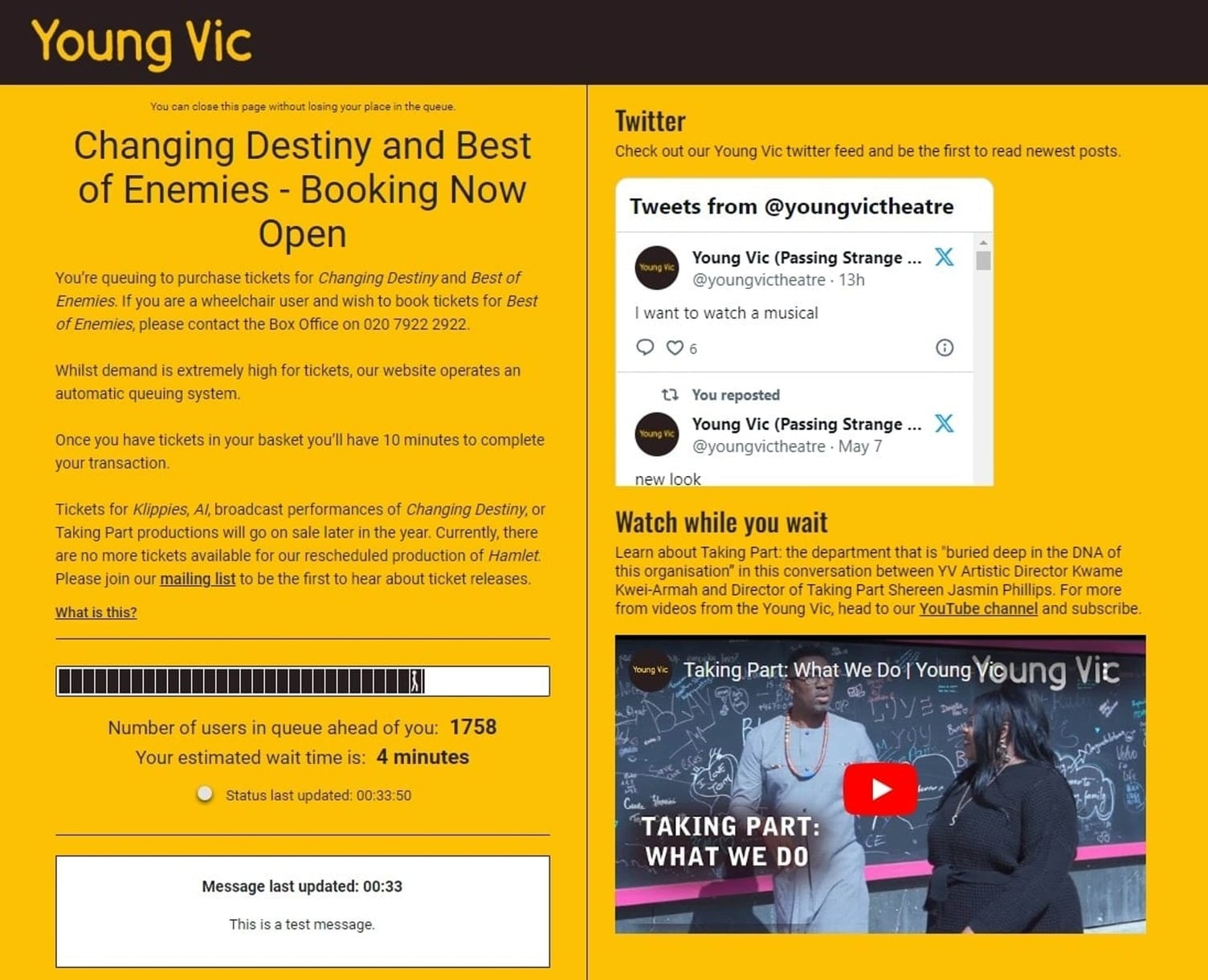
London's Young Vic Theatre makes the most of their waiting room with an embedded X feed, a YouTube video, and a link to their mailing list.
If you don’t want to send customers off your waiting room page, you can also embed engaging media directly onto it, to keep them entertained while they wait.
A common tactic we’ve seen is the inclusion of promotional YouTube videos, product trailers, and other branded videos.
In one case, including a branded video on a Queue-it client’s waiting room drove over 100,000 video views on YouTube and hundreds of subscriptions. One in every four visitors who waited in queue watched the video.
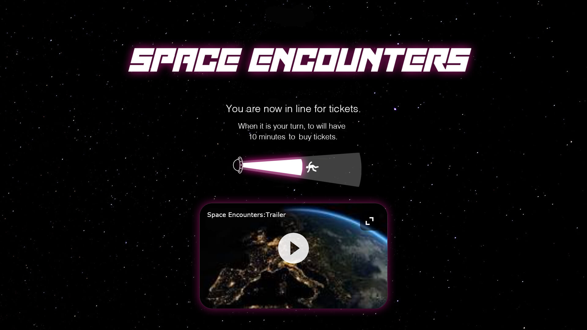
Clients in the ticketing industry often include custom playlists for festivals or concerts to their queue pages. In cases where the event organizers have made the playlists themselves, this tactic drives likes, follows, and plays on streaming services.

You can grow your first-party data on the queue page through a simple email form, but how much does that really tell you about your customers?
To take data collection one step further, you can add interactive surveys, quizzes, or simple games to your waiting room for deeper insight into customer preferences and desires.
These interactive elements can become a rich source of data for personalizing future communications and recommendations to customers.
You can even use this data to direct product development or marketing strategies by polling customers on broader questions like “Which color would you like to see this sneaker in next?” or “How did you find out about this event?”
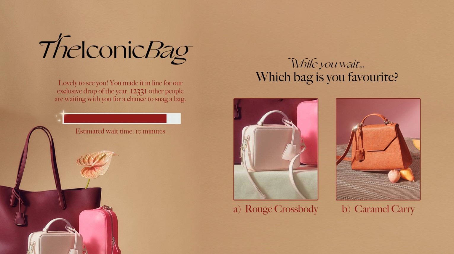
It may not sound like a good idea to promote other companies to the customers waiting to access your site, but what if doing so could drive revenue and strengthen partnerships?
When done right, using your queue page as an affiliate and/or partner marketing tool can benefit everyone involved.
A large U.K. football club we work with, for example, includes a banner on their queue page that links out to their booking partner's website.
Many people who get tickets to a football match also need to purchase transport and accommodation, so the link to the booking site simply makes a useful recommendation to customers in queue.
In this way, an affiliate link on the queue page can be a mutually beneficial agreement that sends your customers to your partner’s site without risking your sales. You get paid for the referrals, your partners get new customers, and your customers get a convenient recommendation for a complementary product or service.
The trick with affiliate marketing is finding companies that complement, rather than compete, with the products or services you offer:
- If you’re an airline, your queue page might link to a travel insurance partner
- If you sell kitchen accessories, you might link to a food box subscription company
- If you sell fitness apparel, you might link to an online fitness app or program
- If you're running an arts & crafts event, you could link to an arts supply store
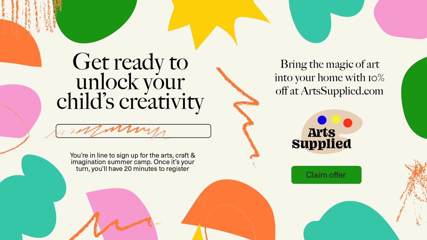
If you’re an online marketplace selling products from a wide variety of brands, you’re probably familiar with the concept of retail media.
It’s an industry forecasted to reach $160 billion in spend by 2027, and is used by major retailers from Amazon to Walmart to Tesco to Best Buy.
Retail media involves marketplaces charging brands to promote or highlight particular products on their site via banners, home page features, recommendation panels, or search features.
The virtual waiting room is an opportunity to expand your retail media offerings. You can offer—at a price—sellers on your marketplace the opportunity to display their products to a highly engaged audience.
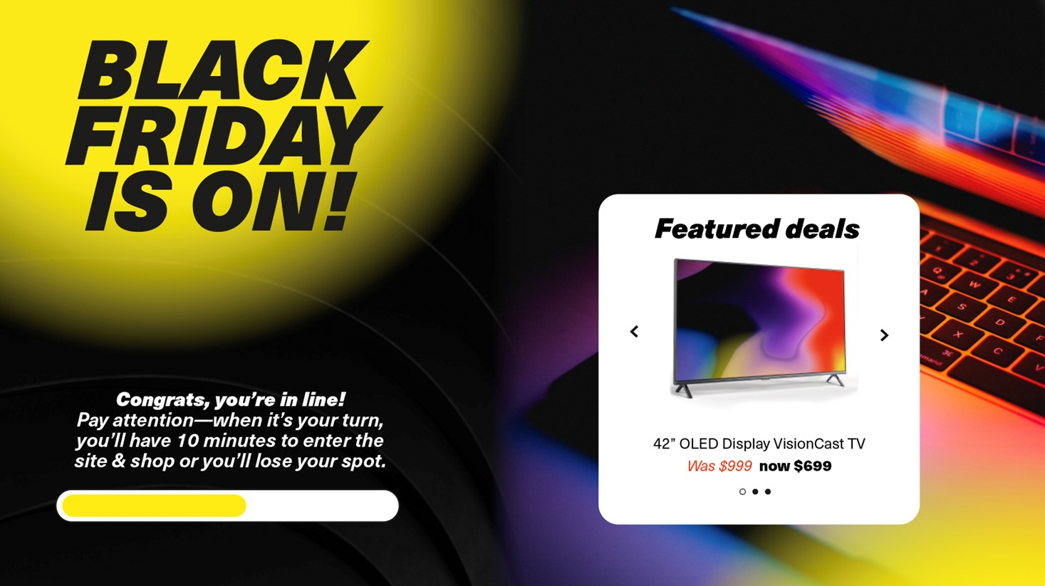
If your product or sale item is in high demand, there’s a good chance not everyone who’s waiting in queue will be able to purchase it.
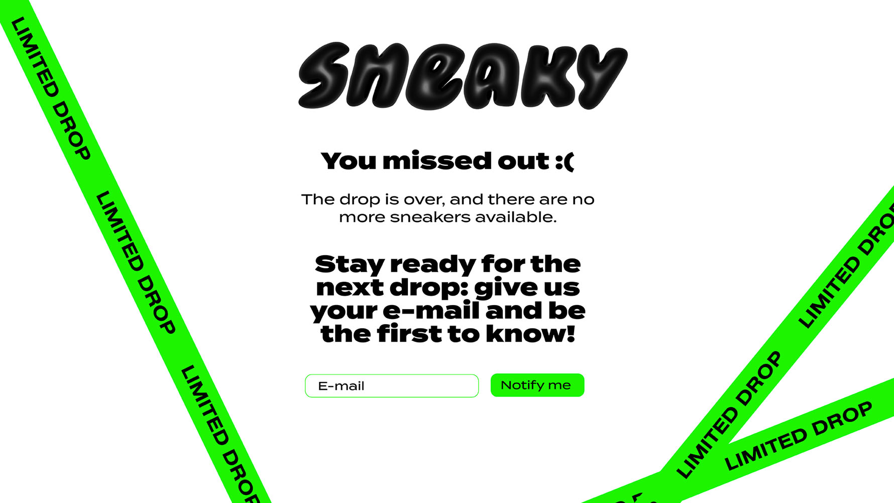
Rather than directing those who missed out to a standard “sold out” page when the product has sold through, many Queue-it customers use the post-queue feature to send visitors to a customized page that offers them other options.
With a post-queue, you can encourage customers to sign up for restock notifications, to join your loyalty program for early access, or you could use it as a chance to show off similar products, events, or offers.
To learn more about Queue-it custom themes and what you can do with your waiting room, check out:
- The full custom waiting room gallery
- Custom themes for developers
- Or book your product demo & request a custom mock-up
